Responsive images with FeinCMS
18.12.2015
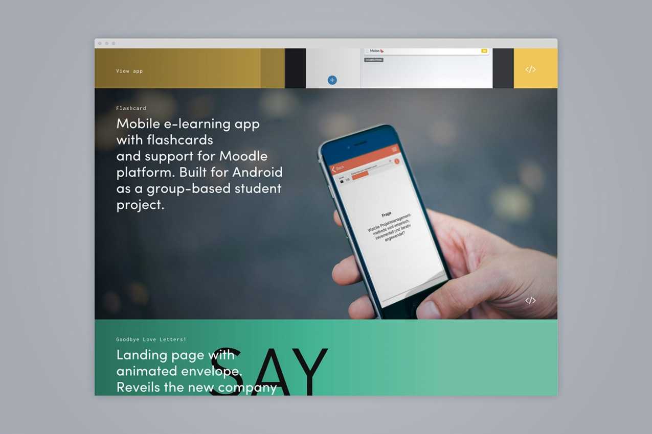
I recently implemented a new version of my portfolio page. Design kudos to MOTO. For each project there’s a big picture which should be adjusted for all major browser resolutions. I looked around if there are any Django plugins available which solve this. After browsing around on django-packages I only found a few, but most of them were outdated or just to complex for my use-case.
So I went with what I already was using: FeinCMS comes with a small thumbnail library to crop/resize images. With a little bit of Javascript and jQuery I implemented the following solution:
Django Template
I render 3 resolutions of the original image. This only happens once after a new image is being added through lazy loading.
{% load feincms_thumbnail %}
<div
  class="project"
  data-bg1x="{{ project.image|thumbnail:'768x99999' }}"
  data-bg2x="{{ project.image|thumbnail:'1200x99999' }}"
  data-bg3x="{{ project.image|thumbnail:'2400x99999' }}"
  data-orig="{{ project.image.url }}"
>
  ...
</div>
responsive-images.js
This script detects the current matching media query and sets the given resolution.
| Device | Resolution | Image width |
|---|---|---|
| Desktop | 3x | 2400px |
| Tablet | 2x | 1200px |
| Phone | 1x | 768px |
Note: 768px is still pretty sharp on mobile device although the resolution is name 1x.
If no media query is matched (i.e. with IE) it will use 3x as the default.
// Load images based on the current screen resolution

function getResolution() {
  // default resolution (1200px) and fallback for old browsers
  var resolution = '3x'
  if (window.matchMedia !== undefined) {
    if (window.matchMedia('(max-width: 375px)').matches) {
      resolution = '1x'
    } else if (window.matchMedia('(max-width: 768px)').matches) {
      resolution = '2x'
    }
  }
  return resolution
}

function loadBackgroundImages(elements) {
  var resolution = getResolution()
  $.each(elements, function(index, value) {
    var element = $(value)
    if (element.attr('no-thumb') !== undefined)
      element.css('background-image', 'url(' + element.attr('data-orig') + ')')
    else
      element.css(
        'background-image',
        'url(' + element.attr('data-bg' + resolution) + ')'
      )
  })
}

function loadImages(elements) {
  var resolution = getResolution()
  $.each(elements, function(index, value) {
    var element = $(value)
    element.attr('src', element.attr('data-bg' + resolution))
  })
}
Applying to elements
Finally you can call the preferred method with a passed jQuery object.
IMPORTANT: This only works on onload, resizing doesn’t have any effect on this by default.
loadBackgroundImages(\$('.project'))

loadImagesAsync(\$('.image-content img'))
As for now it is a quick hat but works just fine for me. @almonk uses a similar approach on his site: https://github.com/almonk/alasdairmonk.com/blob/gh-pages/static/js/main.js.
Eventually I will convert this into a jQuery Plugin and publish it on my GitHub account 😉.
